
Personal income levels across the U.S. vary widely, shaped by differences in industries, costs of living, and economic growth.
This map lists states by their per capita personal income, showing where residents, on average, earn the most.
The data, via Visual Capitalist’s Pallavi Rao, for this visualization comes from the U.S. Bureau of Economic Analysis, compiled by StatsAmerica.
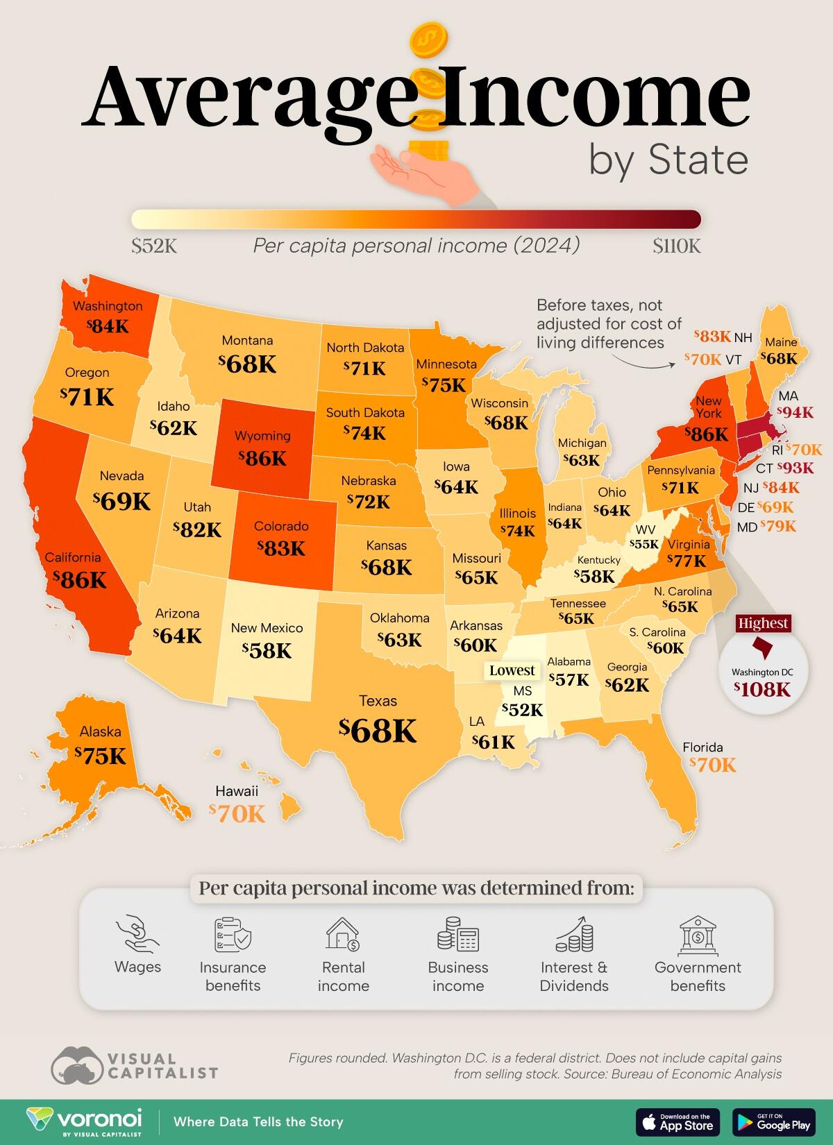
These figures include pre-tax earnings from: wages, insurance & government business & rental income, interest, and dividends, unadjusted for living costs.
It does not include capital gains from selling stock.

